VIP Program
VIP Program
Product Design, UI/UX
Product Design, UI/UX
2025
2025
One of the most important sections on the platform, yet the loyalty program felt flat, confusing, and completely disconnected from the excitement of the product.
A competitive redesign chosen over multiple proposals, introducing a gamified gem-based visual system aligned with the Palms 2.0 direction.
VIP Program
Product Design, UI/UX
2025
One of the most important sections on the platform, yet the loyalty program felt flat, confusing, and completely disconnected from the excitement of the product.
A competitive redesign chosen over multiple proposals, introducing a gamified gem-based visual system aligned with the Palms 2.0 direction.

Overview
A program that forgot it was supposed to be exciting.
No clear hierarchy, no readable tier structure, no sense of progression. For a system built to motivate players, it communicated almost nothing.
The Problem
Functional but forgettable.
Players could not identify their tier, track progress, or feel motivated to engage. The previous design showed no understanding of user psychology or basic design principles.
My Role
UI/UX Designer
I owned the visual direction, component design, and prototyping end to end. My proposal was selected by stakeholders over competing submissions from other designers.
Design Direction
Designed for the feeling of winning.
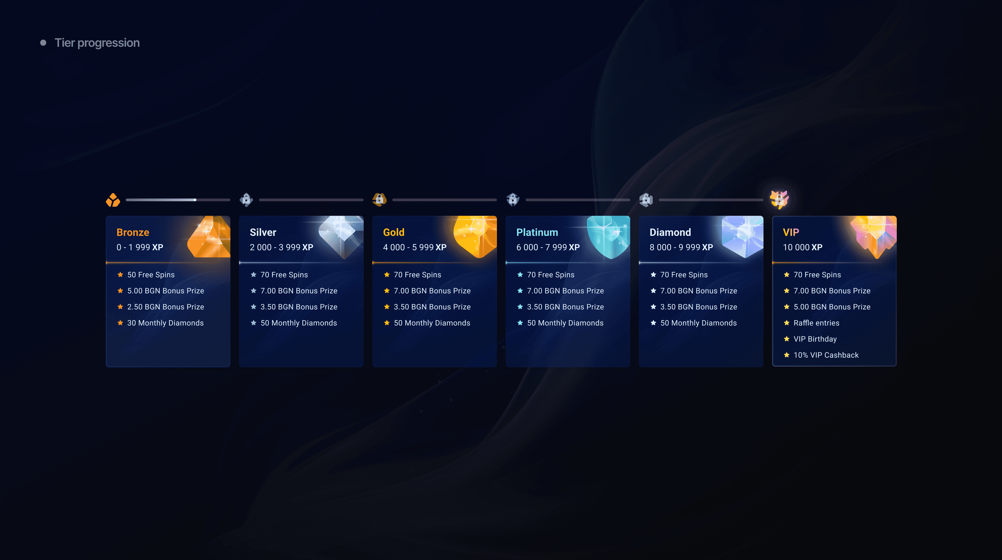
Casino players respond to color and visual reward. Drawing from gamified systems like League of Legends, I introduced a gem-based aesthetic giving each tier its own identity. Bold by design, because the audience expected excitement.
Key Screens
The system in detail.
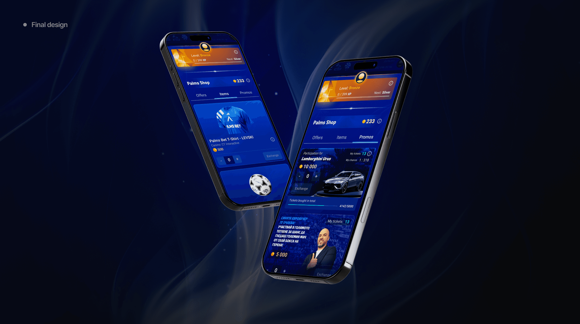
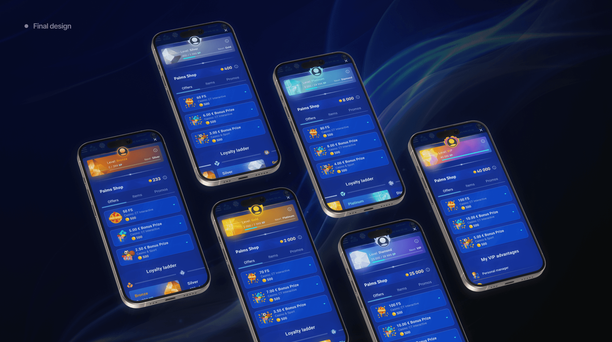
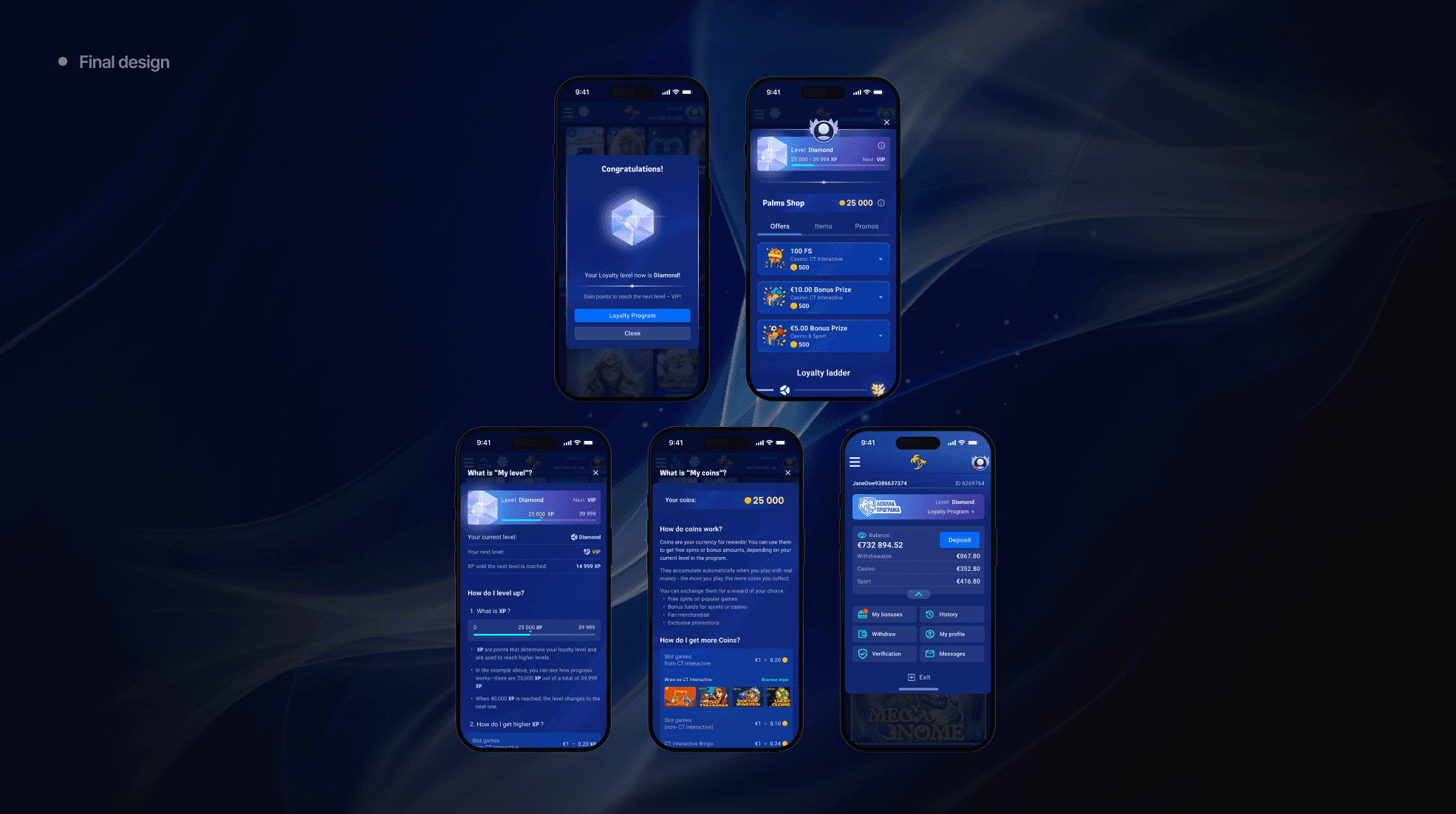
The loyalty page shows tier status and XP progress at a glance. The Essence Shop surfaces rewards in a scannable, visually rich format. Each tier feels distinct while staying consistent within the system.
Outcome
Chosen, refined, and shipped.
My version was selected over competing proposals. Minor adjustments were made to align with Palms 2.0, the gem currency became a gold coin and some effects were simplified. It is always better to have things to remove than to wonder what to add.
Overview

The Problem

My Role

Design Decision


Key Screens

Outcome
Overview
A program that forgot it was supposed to be exciting.
No clear hierarchy, no readable tier structure, no sense of progression. For a system built to motivate players, it communicated almost nothing.

The Problem
Functional but forgettable.
Players could not identify their tier, track progress, or feel motivated to engage. The previous design showed no understanding of user psychology or basic design principles.

My Role
Primary designer across the full redesign.
I owned the visual direction, component design, and prototyping end to end. My proposal was selected by stakeholders over competing submissions from other designers.

Design Direction
Designed for the feeling of winning.
Casino players respond to color and visual reward. Drawing from gamified systems like League of Legends, I introduced a gem-based aesthetic giving each tier its own identity. Bold by design, because the audience expected excitement.


Key Screens
The system in detail.
The loyalty page shows tier status and XP progress at a glance. The Essence Shop surfaces rewards in a scannable, visually rich format. Each tier feels distinct while staying consistent within the system.
Outcome
Chosen, refined, and shipped.
My version was selected over competing proposals. Minor adjustments were made to align with Palms 2.0, the gem currency became a gold coin and some effects were simplified. It is always better to have things to remove than to wonder what to add.
